posts
Panoramas, not pages
The hub is one wide page that pans. Four layers move at their own speeds, and the next section always peeks in from the right.
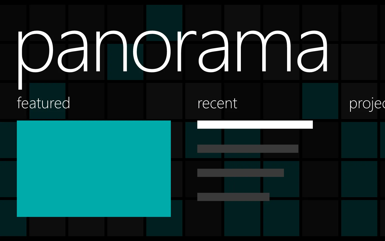
Windows Phone’s hubs weren’t pages. They were panoramas: one long horizontal canvas, wider than the screen, that you swiped through section by section. The next section’s header always showed at the right edge, so you knew there was more without anyone telling you.
Four layers
The original design guide describes four layers, each with its own motion:
| Layer | Moves |
|---|---|
| Sections | with your finger |
| Section headers | with their sections |
| Background image | slower than the sections |
| Title | slowest of all |
Continuum’s hub follows it. Drag the sections and the title drifts behind them. When you pan past the last section, the first comes back around from the right, and the title slides home.
Every way in
- Touch: swipe, or flick. A flick always moves on a section.
- Mouse: drag it, use the wheel (one section per notch), or the arrows that appear at the edges.
- Trackpad: swipe sideways and it follows, then settles.
- Keyboard: the arrow keys move between sections, and tabbing into a section pans to it.
Each section scrolls up and down on its own, so a long list never fights the panning.
Setting it up
The sections are a list in src/config.ts:
sections: [
  { type: 'featured', title: 'featured' },
  { type: 'posts', title: 'recent', count: 6 },
  { type: 'projects', title: 'projects', count: 7 },
  { type: 'about', title: 'about' },
  { type: 'now', title: 'now' },
  { type: 'tags', title: 'topics', count: 12 },
],
Reorder them, rename them, or drop the ones you don’t need. A page section shows the body of any page in src/content/pages.