posts
Typography is the interface
Big, light type on a strong left edge does the work that chrome usually does. A look at the type ramp and the face behind it.
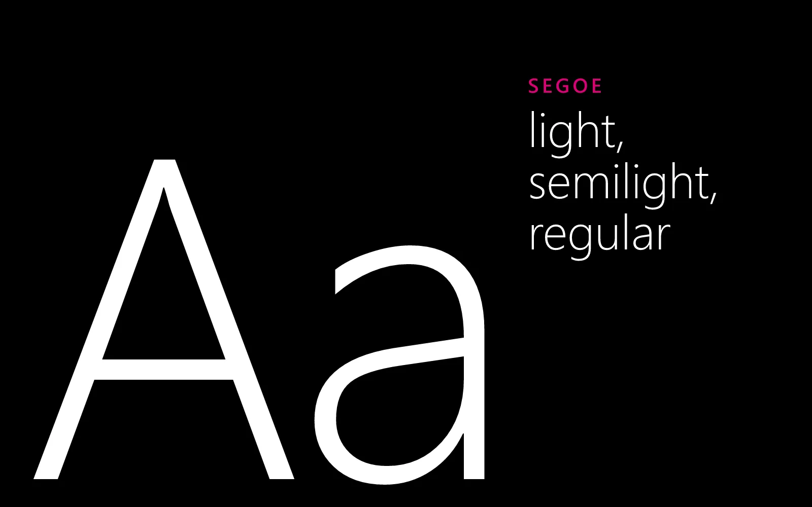
Metro had a line for it: typography is beautiful, period. Its interfaces had almost no buttons, borders, or boxes. The type itself was the structure. Big, light headings set the hierarchy, and a single strong left edge lined everything up.
The face
Continuum is set in Segoe, the family Metro was drawn in. Windows already has it, so a Windows visitor sees the real Segoe UI. Everyone else gets Noto Sans, an open-source face that grew out of Steve Matteson’s Open Sans (he drew Segoe too), cut to Segoe’s weights and scaled to its size, so lines sit where they would in Segoe.
The ramp
| Use | Size | Weight |
|---|---|---|
| Panorama title | a quarter of the screen | light |
| Page title | up to 88 px | light |
| Section and pivot headers | up to 60 px | light |
| List titles | up to 29 px | semilight |
| Body | 18 px | regular |
| Labels | 13 px capitals | semibold |
Light weights carry the big sizes and regular carries the reading. Small labels go in capitals with wide tracking, the way Windows Phone set an app’s name above its pages.
Lowercase where it’s navigation
Headers that move you around (the panorama, the pivots, the menu) are set in lowercase, as they were on the phone. Your own titles keep the case you write them in.